How To Style your map layers in Mapify
January 9, 2023
Mário Sobral
Your data can be very accurate and timely, but it is as important for you to convey the underlying information to your users in the simplest and most impactful way.
Mapify allows you to style your layer data according to the values of attributes, which will allow you to present amazing location data visualizations to your users.
If you want to dive right in the deep end, feel free to request a Mapify trial here, or click here to schedule a talk with us.
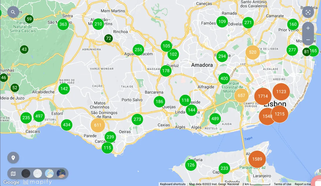
Let’s imagine a dataset which represents different flood risk zones in the city of Lisbon, rendered on a Mapify layer such as the one as illustrated below.
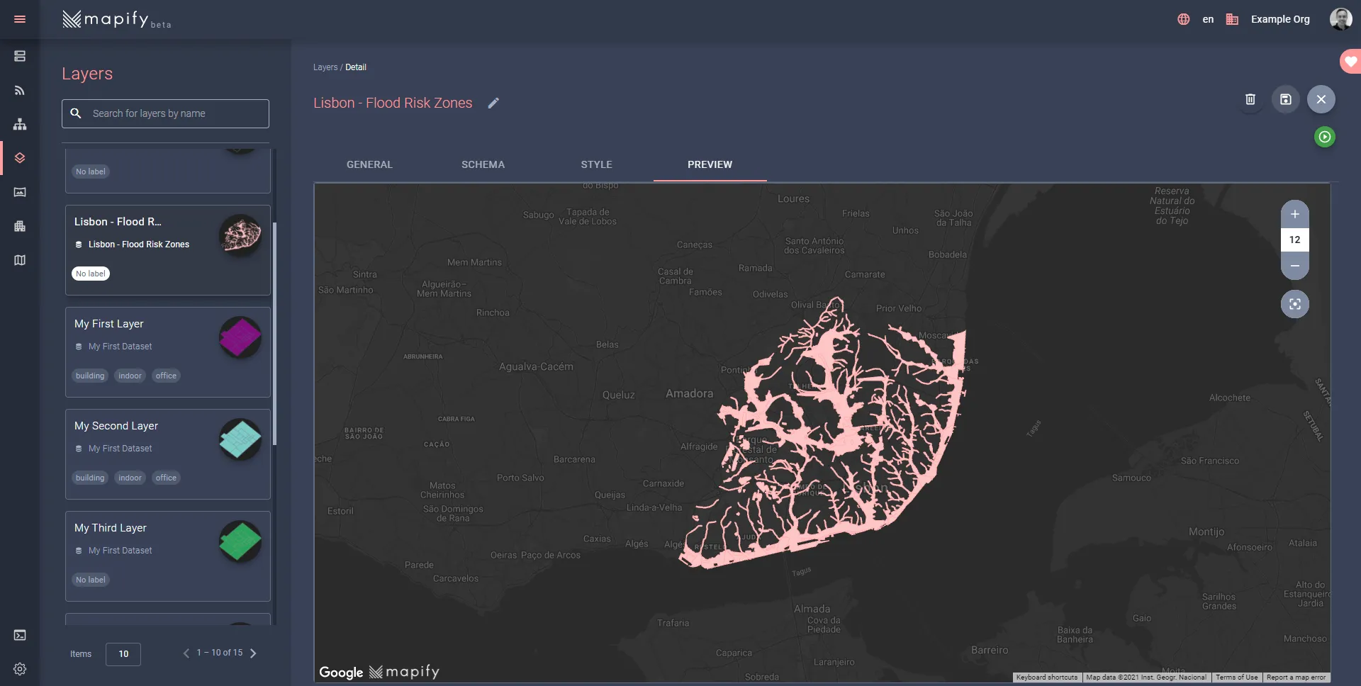
Even though it is easy to see what city areas are covered, but with the current default layer styling we are not able to quickly understand which areas are more vulnerable to floods.
Identify the attributes and their value ranges
Let’s assume we were told that the dataset attribute vulnerabil contains literal values which define the level of flood risk for each feature. The risk can be interpreted according to the attribute values:
- muito elevada — Very high
- elevada — High risk
- moderada — Moderate risk
Any other value means low or no flood risk at all.
Define the layer style according to attribute values
In the layer’s Style tab, click on the By Attribute button, to display the respective style configuration interface.
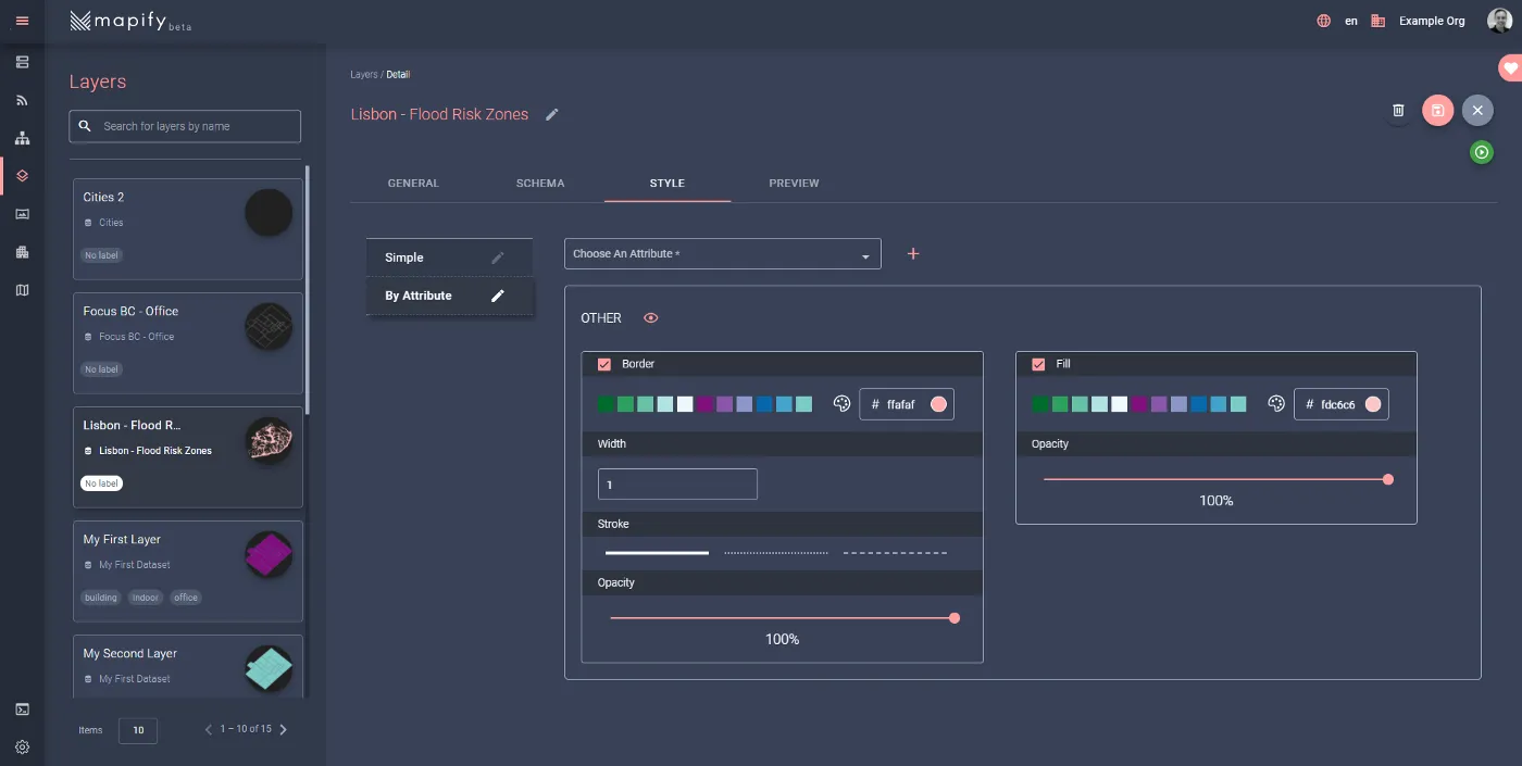
The initial style you see is the style that will be applied to all features which will not match the attribute values you define here. So, let’s add our attribute styling, by selecting vulnerabil from the attribute dropdown list and clicking on the (+) button to add the first style rule.
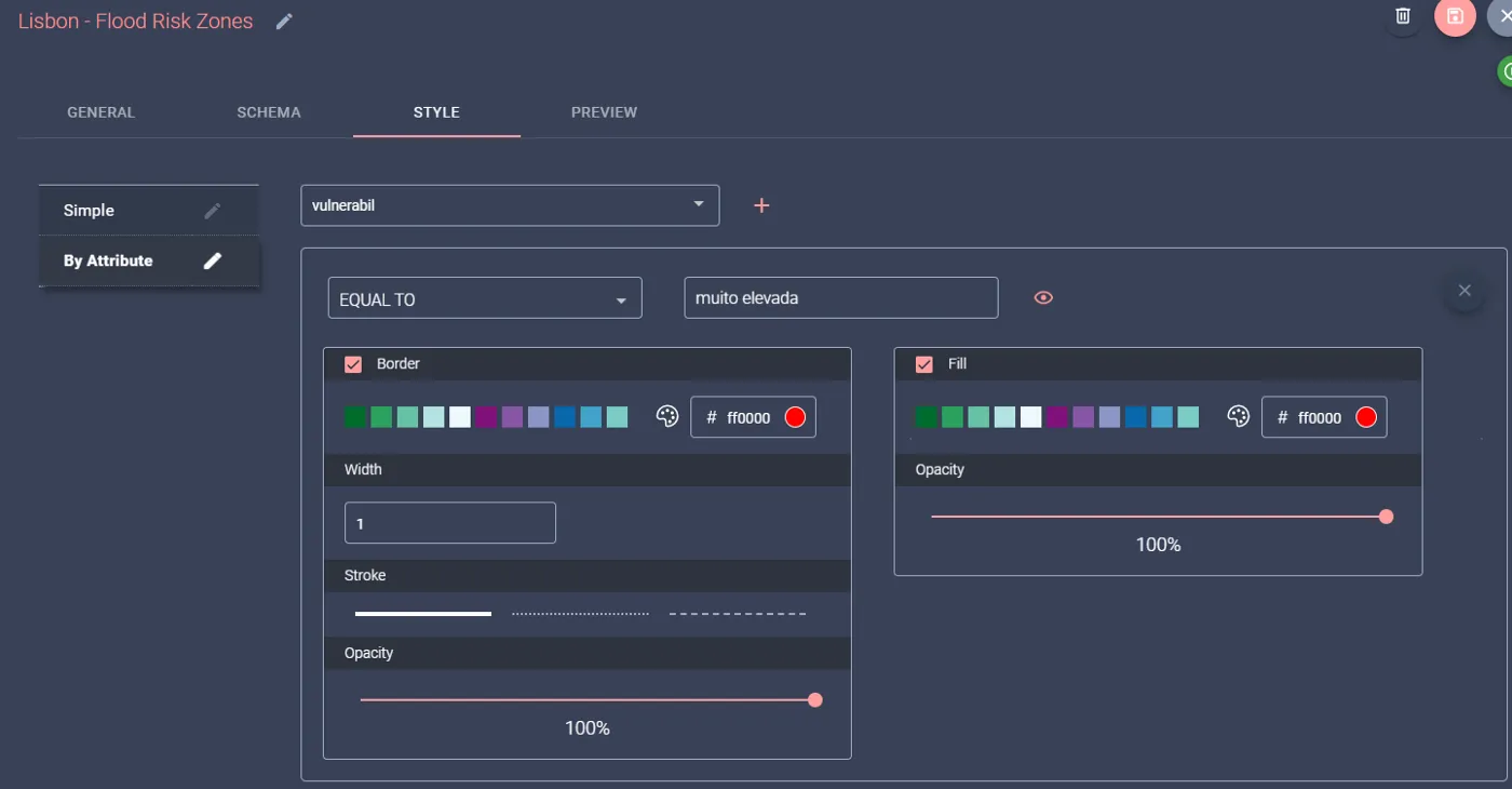
Make sure you select “EQUAL TO” in the operators dropdown list, type muito elevada for its value, and select a vivid red color for both the polygon border and the fill (it’s for very high flood risk areas, after all).
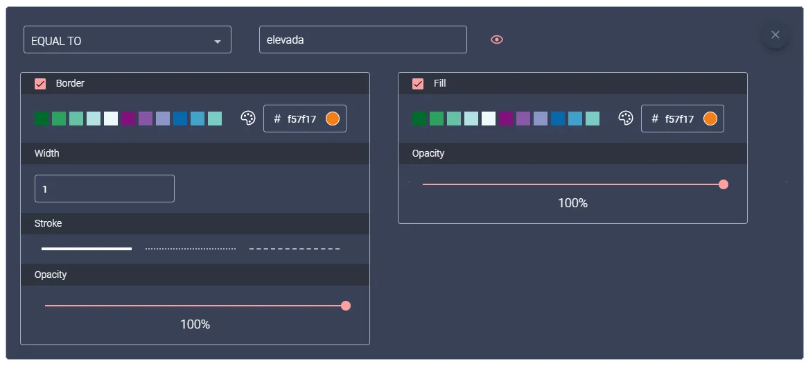
Click again on the (+) button to add the second style rule, and in the newly created rule configuration, make sure you select “EQUAL TO” in the operators dropdown list, type elevada for its value, and select an orange color (it will represent high flood risk areas). It should look like the example below.
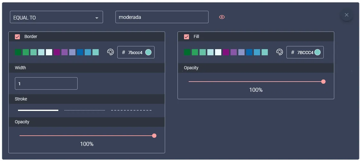
Click once more on the (+) button to add the third style rule, and in the newly created rule configuration, make sure you select “EQUAL TO” in the operators dropdown list, type moderada for its value, and select a lighter color (it will represent moderate flood risk areas). It should look like the example below.
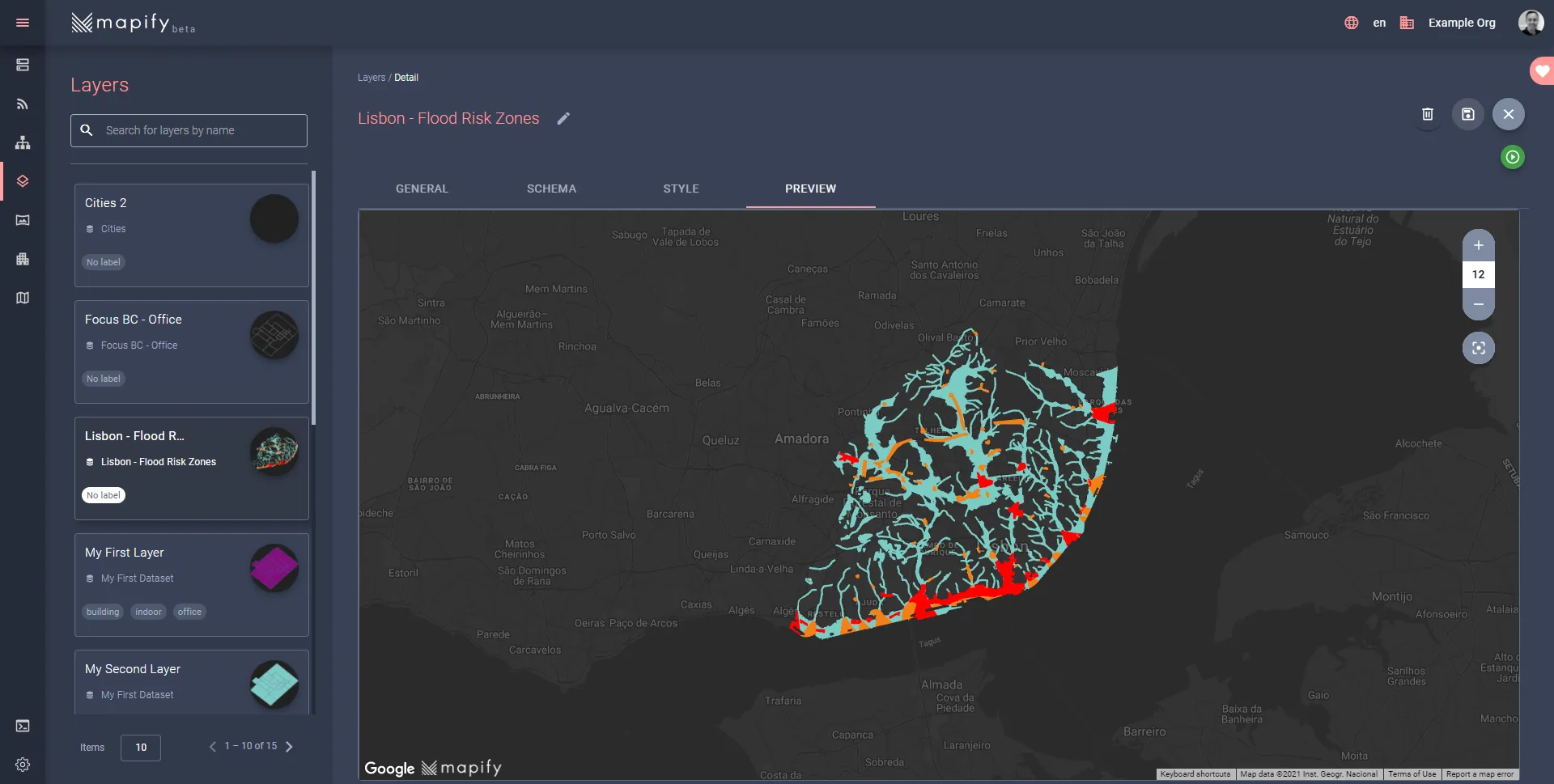
Save the changes to the layer, click on the Preview tab, and you should have a much more informative and colorful representation of your data.
I hope you enjoyed this walkthrough and can now see the amazing and powerful role of layer styles in Mapify!
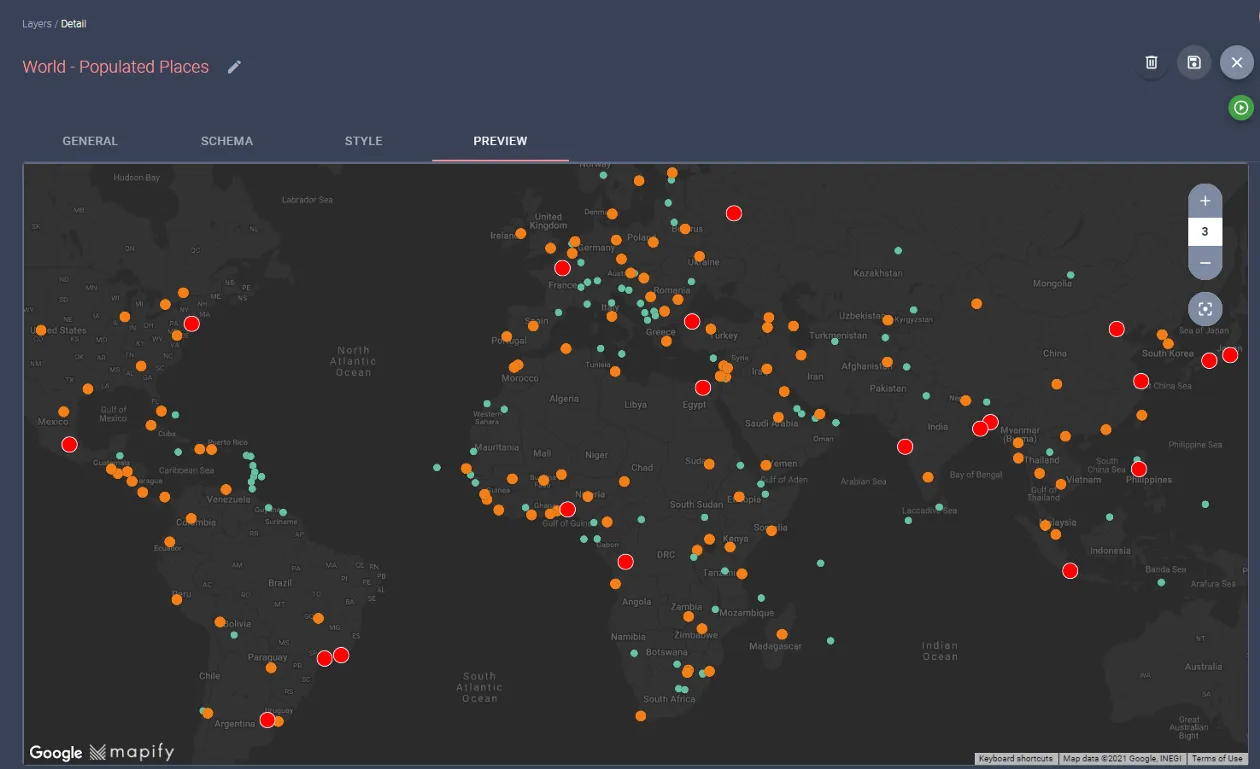
Want to try it for yourself? Below you can find a world map with countries coloured according to population numbers. You can get the World Country Polygons - Very High Definition data from The World Bank, here. Download it, upload to Mapify and Style it!
Ready to power your solutions with Mapify? Feel free to request a Mapify trial here, or click here to schedule a talk with us and we’ll show you what Mapify can do for you and your business.