4 Ways to use Mapify for city map projects
December 16, 2025
Nuri Shahzad

When it comes to managing a city, teams work with a lot of information. Project spreadsheets, service reports, citizen feedback, event calendars and documents sent by email. All of this is valuable data, but most of it still lives inside files and folders.
Mapify helps turn that data into interactive maps without needing a technical background. In this blog post, we look at four simple city map projects that any team can create with Mapify, using data they already collect.
These projects are practical and realistic. They provide a clear first experience of seeing data on a map and help show the value of a mapping platform before moving into more advanced use cases.
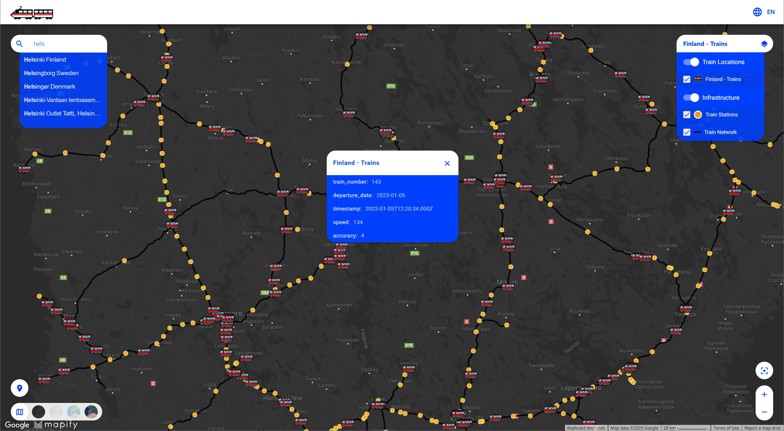
1. Ongoing city projects
One of the most impactful ways to use Mapify is to create a map that shows where the city is investing and working right now. This can include road works, school renovations, public space upgrades, playgrounds, cycling infrastructure or EV charging stations.
This type of map is useful because it gives a clear picture of what is happening across the territory. It helps answer simple questions from management and citizens such as what is happening in my area, which streets are affected, which projects are already completed and which ones are still in progress. A city map works very well in presentations and reports compared to a long project list.
How to build it with Mapify
- Start with a simple table of projects in a spreadsheet. Include at least the project name and a location or address. If you have them, you can also add columns for department, status and dates.
- Import this table into Mapify and each project appears as a point on the map. From there, you can choose colours or icons for different statuses and add basic filters such as area or department.
- The result is an interactive city map of ongoing projects that reflects your data in real time whenever the table is updated.
For a step by step example, watch our walkthrough “How To Transform Your Spreadsheet into a Mapify Map” and see how a simple table becomes a live project map.
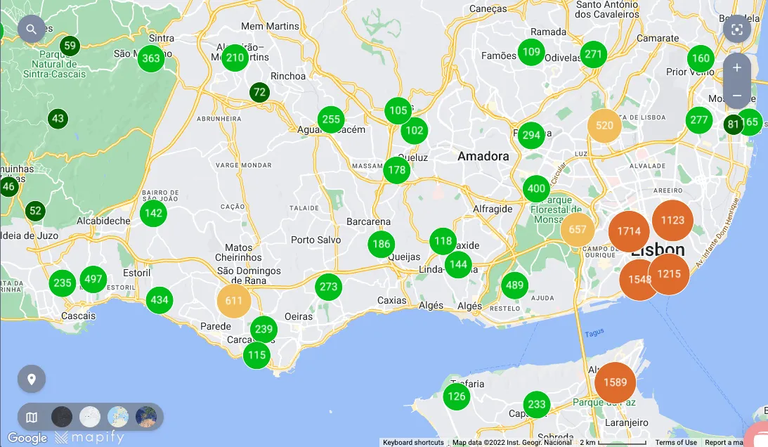
2. Citizen feedback
Another powerful way to use Mapify is to bring citizen feedback together on a single map. This can include complaints, service requests and suggestions related to mobility, environment, safety, public lighting, cleanliness and many other topics.
Seeing this information on a map makes patterns much easier to spot. Teams can quickly identify streets or neighbourhoods where the same type of issue appears repeatedly. This helps them prioritise interventions and allocate resources based on real data. It also supports transparency, because it becomes easier to show that feedback is being monitored and used to guide action.
How to build it with Mapify
- In many cities, feedback is already stored in a CRM, ticketing tool or service portal. Mapify does not replace these systems. Instead, it connects to them and turns their records into a visual layer on the map.
- Mapify can read data from external systems through an API or an open data endpoint. Once this connection is in place, each feedback record becomes a point on the map, using the location already stored in the source system. Categories such as mobility, environment or safety can be used to style and filter the map, so patterns are easy to see at a glance.
- The source system continues to be the place where feedback is created and managed. As new cases are opened or updated there, Mapify pulls the latest data at regular intervals and keeps the map in sync automatically. This gives teams an up to date view of citizen feedback without needing to manage files or write any code.
3. Events and community spaces
A third way to use Mapify is to create a map that highlights where people can meet, learn and enjoy the city. This kind of map can include cultural events, markets, festivals, libraries, youth centres, sports venues, senior activities and other community spaces.
For the communications and tourism departments, this type of map is very helpful. Provides an easy way to see what is happening in different parts of the city and discover new places to visit. It also brings all the information into one place, so teams can reuse the same map in newsletters, social media posts and on the city website instead of updating several separate lists.
How to build it with Mapify
- To set this up, the team should gather information that usually already exists in event calendars, cultural agendas or spreadsheets. This includes the name of the event or place, its location, dates and opening hours, and any relevant links.
- After importing the data into Mapify, each item appears on the city map. The team can use intuitive icons for different themes such as culture, sport, youth or senior activities. People exploring the map can filter what interests them most.
- The result is an events and community map that is easy to embed on a website or share as a single interactive link.

4. Sensors and real time monitoring
A fourth way to use Mapify is to bring sensor data onto a map. Many cities already use sensors in areas such as air quality, temperature, waste containers or mobility. These devices constantly measure what is happening on the ground, but the data often stays hidden in technical systems or long tables.
Putting sensor data on a map helps teams see what is happening right now, not just what happened in the past. For example, they can monitor which waste containers are close to full, how air quality changes during the day or where temperatures are higher in the city. It gives operations, environment and waste management teams a live picture of the territory and helps them react more quickly to problems.
How to build it with Mapify
- To create this map, a team starts by choosing one type of sensor, such as air quality sensors or waste container sensors. They use an existing data source, for example an open data feed or an API provided by a supplier, that includes the location of each sensor and a few key readings.
- They then connect this data source to Mapify so that each sensor appears as a point on the map and its latest values are brought in automatically. It is easy to choose how the information is shown, for example by using different colours or icons to represent levels of fill, temperature or air quality.
- Once the connection is in place, the map updates with new readings and gives teams a real time view of the sensor network for their daily decisions. If you would like to see a concrete example, you can watch our short walkthrough on how to display waste container sensors data in Mapify using open data from Santander.
Why use Mapify
Mapify makes it easier for teams to work with the data they already have and turn it into clear, interactive maps. Instead of staying in spreadsheets, project lists, feedback records, event calendars and facility inventories become visuals that everyone can understand.
Maps created in Mapify are simple to explain to colleagues from different departments, because each one tells a straightforward story about what is happening on the ground. They can be reused in meetings, reports and public communication, and updated whenever the underlying data changes.
Most importantly, teams do not need a technical background to get started. With Mapify, they can move from a table to a live map in just a few steps and then gradually add more projects over time. It stays simple and does not require any code.
Ready to see your own data on a map? Start a free trial of Mapify and build your first project map in just a few steps.